Creating the MIDI Friend Icon
When I came to design the icon the MIDI Friend, as it’s a Mac app, I knew it would have to be 3D. When I designed DMX Assistant’s icon, I just used Photoshop and kind of guessed how the perspective should look. It came out not too bad, but looking back, it’s a bit sloppy. I’ve always wanted to learn more about 3D graphics and play with Blender, so this was a good excuse.
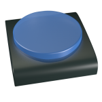
I broke all the rules, and just started making stuff, without really doing any sketching or planning first. I sort of had the idea it should just be like a big button – sort of like the interface of the app.
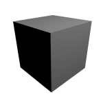
So, Blender has lots and lots of menus everywhere. All I know how to do is make a cube! – so let’s start with that.
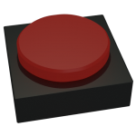
Cylinders are pretty easy too, so let’s make a big red button.
Mac icons have to be shiny, so lets’s play with the lighting a bit.
Trying to get the shape of the base a bit more natural.
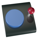
Let’s add another control stick – just a single button is a bit boring! Pretty easy to make out of a cylinder and sphere.
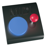
How about adding the word “MIDI” so it’s clear what this does? Wait – isn’t text on icons a bad idea? In general yes, but (just guessing) MIDI means the same thing in other language, so it doesn’t have to be localised. And it doesn’t have to be readable to get the point of the icon across.
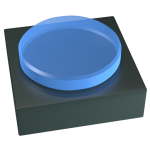
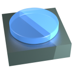
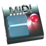
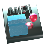
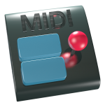
Just had a thought – it could be nice if the icon looked kind of like the app itself! So I decided to add 2 blue buttons like there are in the actual app (to send MIDI note on and off messages)
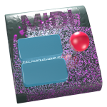
Oops, lighting didn’t work that time!
I want to try and inset the word MIDI into the base of the object. I kind of found a button in Blender that did something like that, but didn’t really work.
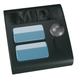
If I sit it on top of a blue bar, that would be like the titlebar of the app:
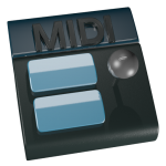
I want the control stick to have a gap in the base to slot into, but I don’t know how to do that! So I sat it on top of a strip thing (rectangle) instead of insetting it.
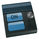
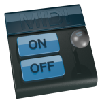
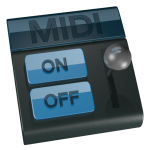
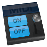
Played around with the lighting and colour once more, so it more closely matches the app.
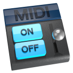
Lastly, I slightly changed the camera angle so it matches up with all Apple’s standard ones (eg. Mail, Preview, Text Edit, Xcode, etc. – all use the same angle, documented in the Human Interface Guidelines). If I was doing it all in 2D in Photoshop, this would be impossible, and I’d just have to live with my initial angle I chose (otherwise I’d have to do it all over again!)
To really finish it off, I added a subtle shadow and outline in Photoshop. Still not sure if this was necessary.
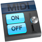
I’m very happy with how it turned out, especially given its the first thing I’ve really done in 3D!
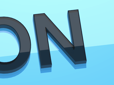
I love all the little detail – it’s not that it would be impossible to do in Photoshop, just really difficult to get all the perspective and everything. Here’s a close up shot of the “On” button:
I’m going to have to do all my Mac icons in 3D from now! No, it’s not perfect – a more experienced icon designer and 3D modeller could definitely do a better job, but I’m very happy with my results.
